I think it's funny how all the leaders are trying to get the economy back to where it was...which was at a place that led directly into mayhem.
Do you see the problem here?
We are headed to a whole new way of living whether we want to or not. Whether we admit it or prepare for it or not. You see, the best idea our dear leaders can come up with is to get us back to where we were - teetering on the brink of economic collapse.
That means we are there right now, teetering at this very moment. Simple as that.
Unprecedented actions have been taken globally over the course of the past year or so, and that has bought us some relatively normal time. Time is running short, though.
Feeling depressed yet? Don't worry, read this to gain some understanding of the feelings you either already are or will be feeling sometime soon.
So right now, things in general seem fairly calm. Remember though, when a disaster strikes the time to prepare has passed. So the time to prepare is now. One thing I always try to keep in the back of my mind is a sense of urgency...whatever needs fixed up around the house, whatever crucial item that needs to be acquired...it's better to do it now than wait, because you just don't know what will happen if you wait one day too long. A good plan today is better than a perfect plan tomorrow.
We are currently experiencing a slow crash, a series of relatively gentle steps down. No one knows if it's going to speed up and become a fast crash. All the headlines you see touting recovery and green shoots are nothing but pure propaganda.
One of my core beliefs is that this world we have right now is as good as it's ever going to get. Ok, maybe if you measure your net worth with 7 or more figures, this might not hold true, but for the vast majority of folks I believe it is.
The first step to getting yourself informed (or out of denial as to just how big of a mess we're in) is to try and gain a deeper understanding of the gargantuan numbers used when discussing our economic situation.
First of all let's see what a trillion dollars actually looks like.
Let's see that again in in an animated version.
The third times the charm!
Here are some fun, brief and illustrative videos. Keep in mind these are older: One Two Three Here is a recent video from this guy that I liked.
Here is a 4 minute vid that scared me silly when I first saw it. The most important thing about this vid is to see how the past peaks and valleys of the chart essentially disappear into a straight line due to the massive scale of what is going on now. The history of the chart is lost to statistical noise. Oh, and if you think I'm being disingenuous because the chart in the vid is over a year old, here is the current one. It's still ridiculously high from a historical perspective. Also, even though it is dropping...I'm not sure that's cause for celebration. Why did it have to shoot the moon to begin with? Why is it falling off a cliff now?
I don't remember Wiley Coyote ever being this funny!
Again, why was this guy just reconfirmed!?
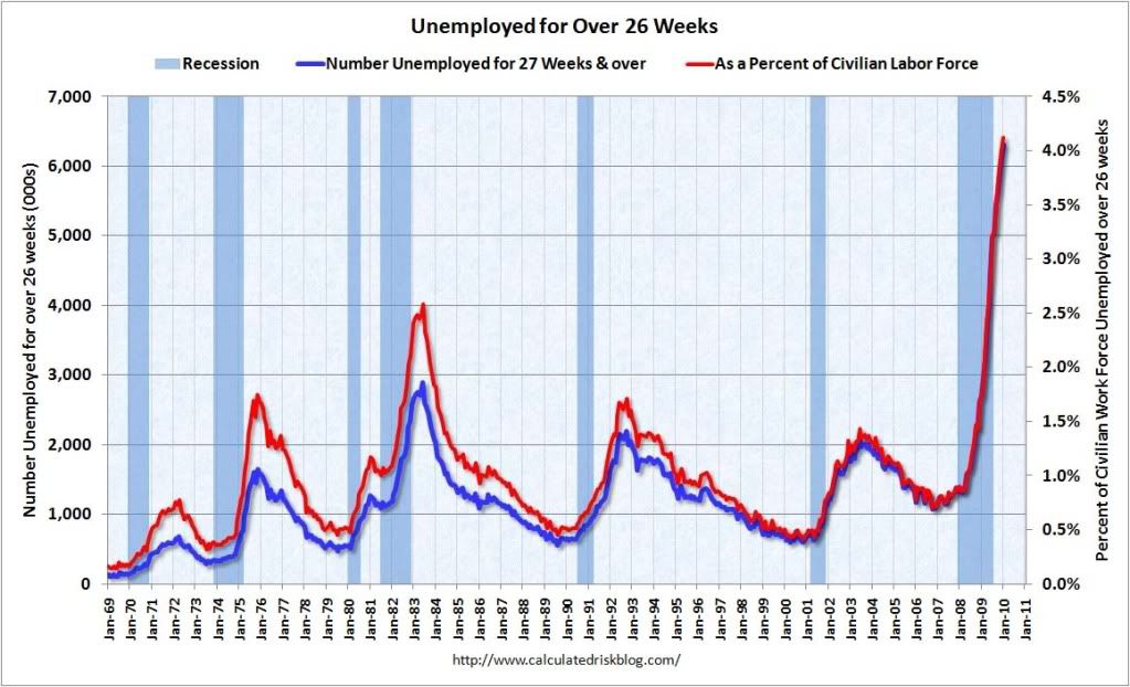
Here's a fun video that sheds light on just how goofy the methodology for determining the unemployment rate is. This video doesn't even get into the whole exhaustion rate issue, which is a measure of the number of people who have collected unemployment insurance for as long as they can and then simply fall off the rolls when they exhaust their benefits. Once this happens, they are no longer officially unemployed either. Unfortunately I can't figure out how to embed the chart, but please go here and look at it for yourself. Also be sure to click on the 5 year button to see what the chart looks like over time.
So are you paying attention yet!? Do you think there is a chance in hell of this ending well!? Yes!? Alrighty then, it's time for...
One chart to rule them all!
I don't know who to credit with making this chart; I've seen it in lots of places, but I got this most recent one from Seeking Alpha.
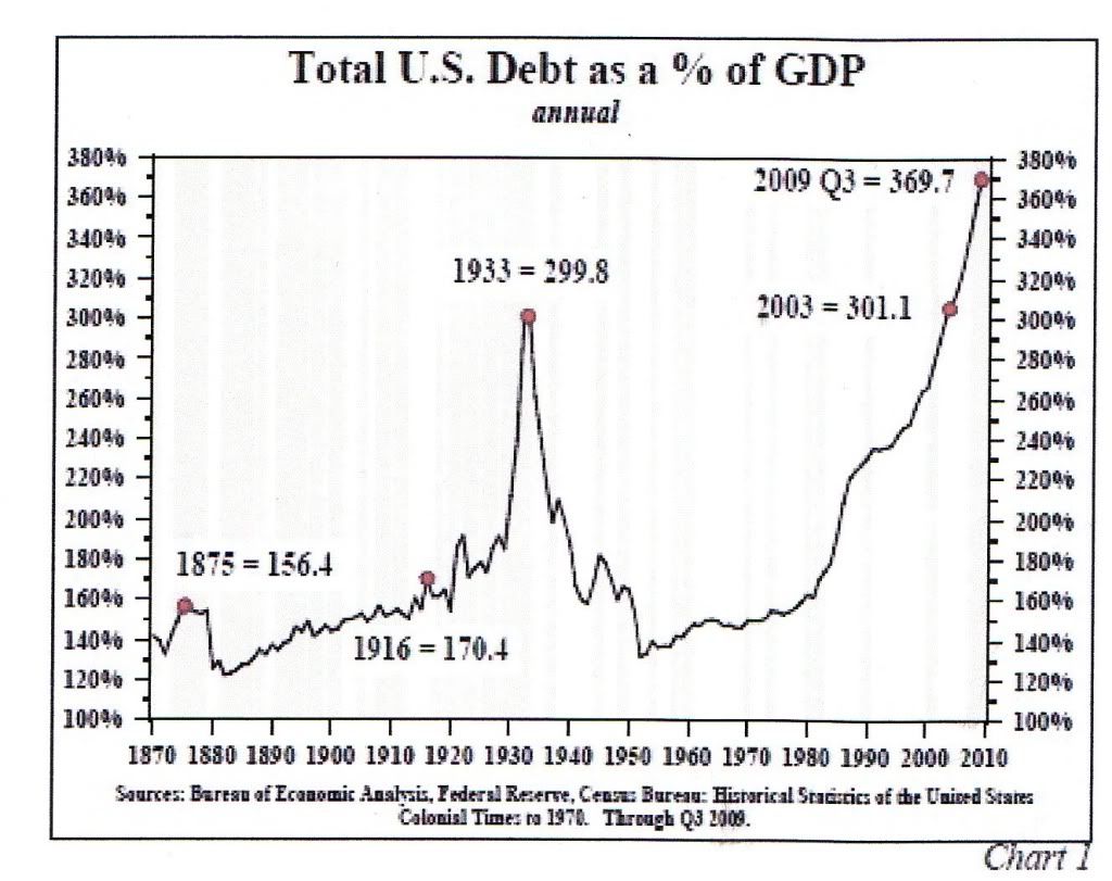
Now here is the chart with some fun red lines added by me. Let's discuss this a little, shall we?
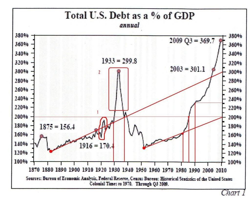
Take a look at the first red circle #1. See that nice bump? I would surmise that that had to do with fueling up the roaring twenties. We all know how that ended, right? You see that big old spike I circled with #2? Well that's what happened due to the great depression. If you notice the lines I dropped down, that spike started in late 1929 and came back to earth around 1938, just about encompassing perfectly the great depression era. Now, the most important aspect of that crazy spike is that is was not caused by the US borrowing like a drunken gambling addict in Las Vegas (like it does now I should say). The great depression was a deflationary episode. What caused that spike was the prices of everything falling away from our debt load. A severe drop in GDP with debt (borrowing) staying flat resulted in that spike. And all this craziness from that little bump in the chart shown in #1. Hmmm....
Now if you draw a trendline from 1880 to the present we "should be" at approximately 300% Debt to GDP (which is still way to high in my opinion). If you draw a trendline from 1950 to the present we arrive at 200% which if you ask me is about the maximum we should ever go to. A funny thing happened just after 1980 though...the chart turned the corner and went parabolic. I'm sure it wasn't evident at the time. But around 1987 it hit 200%. Now, if we were looking at this chart in 1987, we would probably notice that it was starting to look not so good, but not necessarily parabolic, or anything that couldn't be contained. But by 1990 I would say any prudent person looking at this chart in would say "hm, we might be in trouble here." And now, in 2010, it's just ridiculous. If you think this has a chance in hell of ending well, you're either stupid or drunk. Or high, I dunno. Again refer to the bump circled in #1. This helped form the stock market bubble which lead to the crash of 1929 which carried over to the real economy and brought about the great depression. That tiny, cute little bump in #1 did that. LOOK AT THE CHART SINCE 1980! WHAT THE HELL IS GOING TO HAPPEN WHEN THAT BAD MOFO POPS AND REVERTS TO THE MEAN? We all think the great depression was a pretty rough time in our history, because it was. But you better buckle up because that was just a dress rehearsal for what's coming. Keep in mind that the US and most (if not all) of the large economies are currently GOING DEEPER INTO DEBT!
In summation, this chart represents the US's credit card. It was used prudently, for the most part, up until the 1980's. At this point it's maxed out, and apparently no one at the CC company cares, because of that old chestnut "if you owe the bank a million, you're in trouble, but if you owe the bank 100 million, the bank is in trouble." Except in this case the US is the bank and the whole world is in trouble, thanks to the Bretton Woods agreement which set the US dollar as the worlds reserve currency.
Still not convinced we're in real trouble? Still think me and others like me are just chicken littles? Ok, well, what are the banks preparing for then? Excess reserves is a measure of money able to be lent out, but isn't. Typically banks want to lend out as much as they can; it is after all their raison d'etre. So why isn't it being lent out? 1) Stricter loan conditions (hey they're tired of getting burnt too) 2) Less people able to meet the requirements who would like a loan 3) More people than that who are able to borrow, but just don't want to. But is that all that it takes to explain this chart? I don't think so.
The banks are stocking up on cash. Maybe they're concerned about bank runs as much as I am.
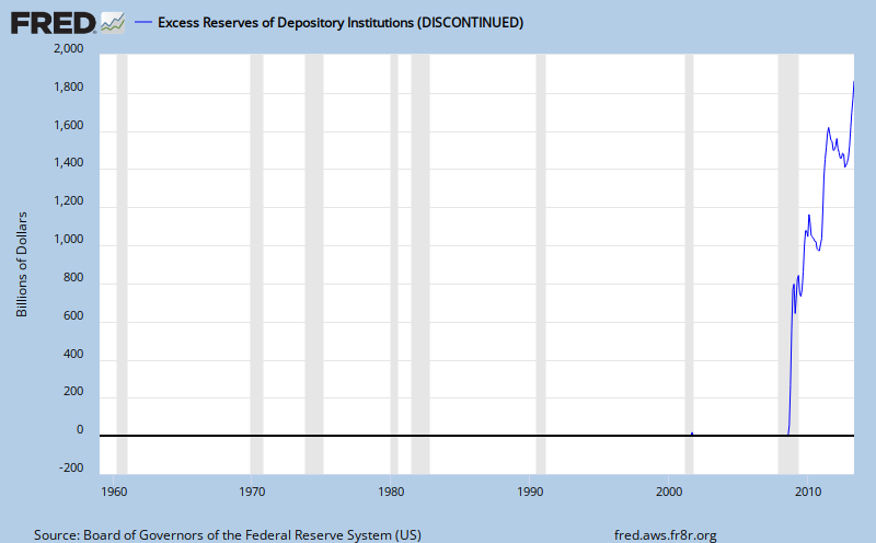
Maybe they're just afraid all the unemployed folks are gonna just start robbing banks:

The Baltic Dry Index illustrates global shipping. Notice the nose dive it took a year ago. Did you see the pictures of all the ships sitting idle all over the world? This is a good chart to keep an eye on. If (when) it drops again, and if it stays low, we will eventually start seeing shortages in our stores. A brief aside, did you know that the average amount of food stored in a grocery store is only enough to last about three days? Three normal days that is. JIT logistics works just fine in normal situations: do any of these charts look normal to you?

So that's it. Actually that's not it, I'd really like to talk about how $4/gallon gas is so cheap as to be essentially free, even though it was expensive enough to play a major role in crippling our economy.
Think about how far you can drive your car on one gallon of gas. Now think how much money you'd have to pay a person to push it that far. Eventually the price of gas per gallon will approach the number in your mind.
I'd also like to get into Jevon's paradox which helps illustrate why conservation of energy and resources actually hurts us instead of helps us, but I won't.
I'd also like to dive into the whole problem of having an economy that needs growth. I mean that's just a truism, right? When the economy grows it's good, and when it shrinks it's bad. Everybody knows that!
But how can you have an economy predicated on infinite growth in a finite world?
A whole lot of our world, a whole lot of systems we depend on and take for granted are grounded in principles that are actually insane, but I won't get into all these things because if this wasn't enough to convince you, those things won't either, and I want to start getting to the meat of my blog: actions I think every single person should be taking right now.
The time to act is now. Good luck to us all.
![[Most Recent USD from www.kitco.com]](http://www.weblinks247.com/indexes/idx24_usd_en_2.gif)
![[Most Recent Quotes from www.kitco.com]](http://www.kitconet.com/charts/metals/gold/t24_au_en_usoz_2.gif)
![[Most Recent Quotes from www.kitco.com]](http://www.kitconet.com/charts/metals/silver/t24_ag_en_usoz_2.gif)
![[Most Recent Quotes from www.kitco.com]](http://www.kitconet.com/charts/metals/platinum/t24_pt_en_usoz_2.gif)
![[Most Recent Quotes from www.kitco.com]](http://www.kitconet.com/charts/metals/palladium/t24_pd_en_usoz_2.gif)
![[Most Recent Quotes from www.kitco.com]](http://www.kitconet.com/charts/metals/base/spot-copper-5y.gif)
![[Most Recent Quotes from www.kitco.com]](http://www.kitconet.com/charts/metals/base/spot-nickel-5y.gif)
